![](https://pro2-bar-s3-cdn-cf2.myportfolio.com/f415cf4fbe8cd6142c2f95d05b3a22c7/d27b1576c8eec0b72e5c6789_rw_1200.jpg?h=5c5b308c21ab93a2b385e675f376b624)
![](https://pro2-bar-s3-cdn-cf4.myportfolio.com/f415cf4fbe8cd6142c2f95d05b3a22c7/f62f59a75e1e17d6401cd4ec_rw_1200.jpg?h=0621dcd852f224488ece22edf928b5b5)
![](https://pro2-bar-s3-cdn-cf6.myportfolio.com/f415cf4fbe8cd6142c2f95d05b3a22c7/aa336ea1d8408dac7401a59a_rw_1200.jpg?h=6e115d6d740a4ca79517d602f4134eb9)
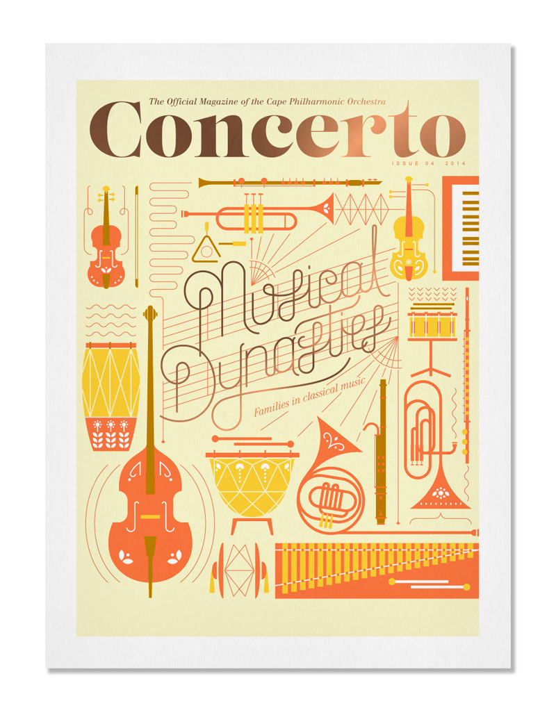
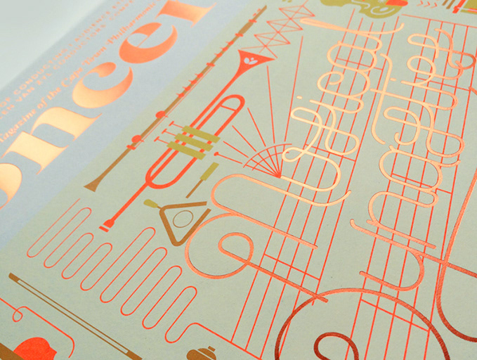
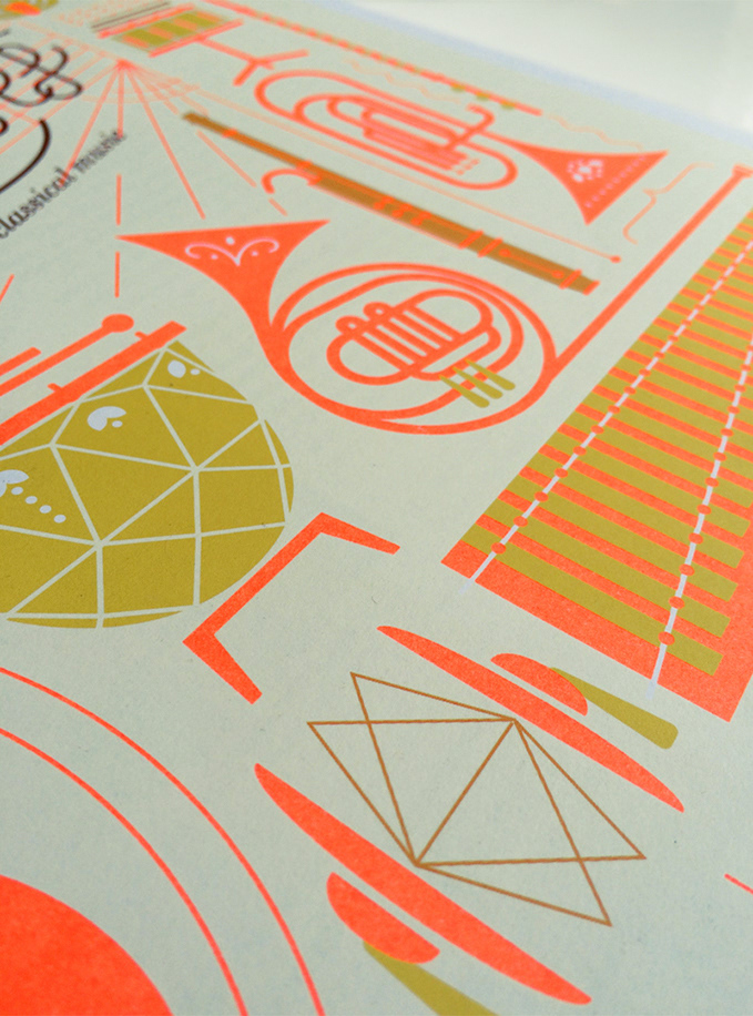
Pure Publishing contacted me to work together on this brief for the cover of Concerto Magazine. This is a quarterly magazine which is funded by the Cape Town Philharmonic Orchestra. The Orchestra turned 100 in this edition so we decided this was a good enough reason to pull out all the stops for the front cover. The A3 publication was printed using 3 neon spot colours and a rose gold foil finish.